I once spent 15 minutes hunting down a slightly lighter shade of blue that shouldn't have existed. I thought my project had two blues. It had seven. Seven nearly identical blues, like Pokémon evolutions I definitely didn't remember catching.
That was when I realized that color wasn't just a design problem but it was a code hygiene problem.
Who this post is for: Developers, indie founders, and builders who care about how their product looks, but don't want to become designers (and definitely don't want to spend their time chasing rogue hex codes across a codebase).
The Color Problem
I'm not a frontend developer by training. My background is in backend engineering and business, not design. For years, I treated color as an afterthought that designers could worry about while I focused on making things work.
That changed when I started building my own projects.
Projects like Trip Threads needed to look decent. Not award-winning, but good enough that people would actually use them. And that's when I discovered that maointaining color and frontend hygeine is incredibly important.
My Specific Pain Points
Finding colors across formats
CMD+F for #1a73e8 works great until you realize you also used rgb(26, 115, 232) and hsl(210, 84%, 51%) in different files. Same color, three different formats, impossible to track.
Managing accidental variations I thought I was using one shade of blue. Turns out I had five shades across the app, which were close enough to look the same but different enough to create inconsistency across the platform.
AI-generated design files are hard to audit AI tools make it easy to generate design files and CSS, but difficult to parse them and ensure consistency. I needed something to visualize all the colors contained in them at once.
The tools available weren't built for this. Figma was too heavy. Find-replace was too dumb. Color pickers didn't show where colors were used.
So I tried to build something better.
Building for Myself First
I started with a simple question: What would I actually use?
Not what developers broadly might need. Not what makes a good product. Just what would solve the problem sitting right in front of me.
The answers shaped the MVP:
- See all colors referenced in a document at once
- Replace the colors visually
- Preserve original format
- Zero friction — paste, fix, copy
- No file uploads or setup
I built the first version over an afternoon using Claude Code. Paste → See Colors → Replace → Copy. That's it.
When I started using it, that's when I saw more potentail enhancements and thats when the real design work began.
UX Decisions That Made It Work
Visual Gallery: The Color Inventory
The problem: You can't search for what you can't see. #1a73e8 won't find the RGB or HSL equivalents.
The solution: A visual gallery of every color in the pasted text.
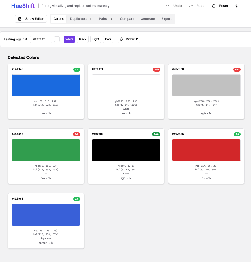
Color cards show the swatch, the format, and usage counts in the document. Click a color to select it for replacement.
Format Preservation: Respecting Developer Intent
Before:
hsl(210, 70%, 50%)

After (other tools):
#3385ff ← loses intent

After (HueShift):
hsl(220, 70%, 50%) ← format preserved
If I wrote HSL, it was intentional and I don't want to turn everything into hex.
The solution: Parse all formats but preserve the original during replacement.
Why it matters: Cleaner diffs, consistent code, and fewer surprises.
Selective Replacement: Surgical Precision
"Replace all" is dangerous. Sometimes you want to change 7 out of 12 instances.
Solution: Two modes
- Replace All for speed
- Selective Mode for precision
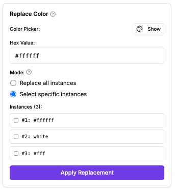
This allows users to preview every instance before applying if they would like to.
Undo/Redo: Because Mistakes Happen
A 50-state history stack with keyboard shortcuts:
Cmd/Ctrl + Z— UndoCmd/Ctrl + Shift + Z— Redo
Design choice: Fast undo beats confirmation dialogs. It encourages exploration.
Accessibility Built In: WCAG Contrast Checker
Foreground/background pairs are auto-detected within the document. WCAG contrast is calculated. Badge results show pass/fail.
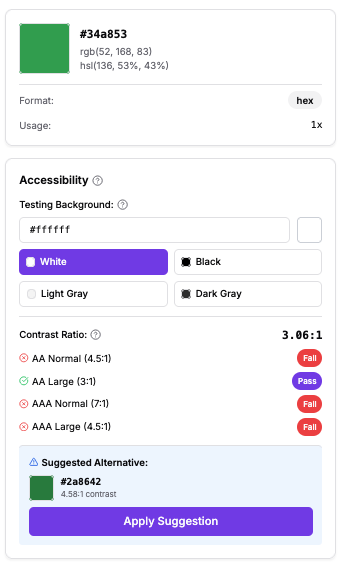
Best part: HueShift suggests accessible alternatives by adjusting lightness while preserving hue.
This means that achieveving optimum accessibility becomes frictionless.
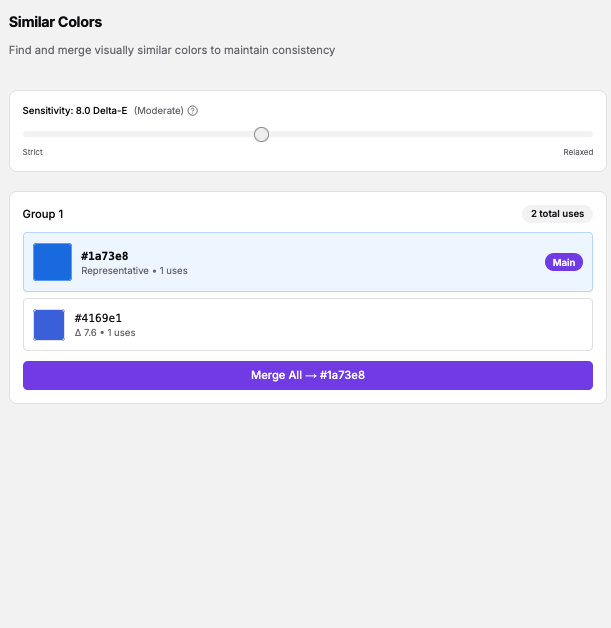
Similar Color Detection: Finding Unintentional Variations
Delta-E in LAB color space finds colors that look identical but differ in code.
Any Accidental clones get grouped together for users to review and they can merge them with a single click.
Beyond My Own Use Case
Once I started sharing HueShift, I explored ways that it could be used beyond my initial use case.
Branding and Design Exploration Paste a site's CSS → adjust one color → see the entire brand shift instantly.
Palette Management and Consolidation Inherited codebases often have "gray inflation." HueShift helps consolidate them fast.
Quick Color Variations for Clients Generate Variation A → undo → Variation B → undo → Variation C.
Closing Thoughts
The best tools solve your own problems first. If they help others, that's validation. If they don't, you still have your tool.
Color management is a code problem as much as a design problem. Developers need speed, accuracy, and clarity and sometimes lightweight tools help solve the problem easily.
If you've ever hunted for colors across formats or accidentally created palette drift, give HueShift a try.
And if it solves your problem too, I'd love to hear about it.
Tools mentioned
- HueShift: https://hueshift-nine.vercel.app/
- Tech: Next.js 14, shadcn/ui, react-colorful, tinycolor2
- Development: Claude Code
- Color Science: WCAG Guidelines, Delta-E